
- الرئيسية
- السمات
النافذة نفسها، بأسلوبك
View → Theme changes how GDM looks at once and keeps everything where it was. Pick one of the built-in looks, each with a light and a dark side, or make your own in a text file.
-


كلاسيكي
GDM's own look and the default: the layout IDM users know, with Windows 11's controls.
-


أصلي
لون تمييز نظامك وإعداد التباين، يتم اتباعهما عند تغييرك لهما، على أنظمة Windows وLinux وmacOS.
-


تباين عال
أبيض وأسود، بلمسة تمييز ساطعة، كل حافة مرسومة، نص بنسبة 7:1 أو أكثر.
-
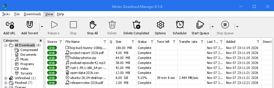

مترو
مظهر Windows 8 المسطح: زوايا مربعة، أزرار مسطحة، وأيقونات بلون واحد.
-


Adwaita
مظهر GNOME: زوايا مستديرة، أزرار رمادية مسطحة، حلقة تركيز مستديرة وشريط عنوان.
-


Breeze
مظهر KDE Plasma: زوايا مستديرة، عناصر تحكم تأخذ حافة التمييز، أيقونات KDE.
-


Luna
إحساس Windows XP: أزرار مظللة بوهج برتقالي، علامات صح خضراء، وشريط عنوان أزرق داكن.
-


Aero
إحساس Windows 7: أزرار لامعة، شريط عنوان زجاجي، وشريط تقدم أخضر لامع.
-


Aqua
إحساس Mac OS X: أزرار جل مستديرة عند الأطراف، حلقة تركيز زرقاء، وشريط تقدم جل أزرق.
- أنشئ سمتك الخاصةملف نصي للألوان والأحجام، يتم تجربته في ثوان. ثلاث خطوات.
أنشئ سمتك الخاصة
A theme is one small text file, in TOML (or JSON). It names only what it changes; everything else comes from the theme it builds on. You don't need to build GDM or know how to program.
أنشئها
ابدأ ببضعة ألوان، ثم أضف المزيد كلما تقدمت:
name = "Harbour" inherits = "classic" icons = "color" [seeds.light] background = "#eef3f6" surface = "#ffffff" text = "#11202b" accent = "#0f6c8c" [seeds.dark] background = "#14212a" surface = "#0e171d" text = "#e8f0f4" accent = "#5cc3e6" [sizes] radius = 6 [controls] focus = "ring"inheritsهي السمة التي تبدأ منها سمتك:classic(الافتراضية)،high-contrast،metro،adwaita،breeze،luna،aero،aqua، أو ملف سمة آخر في نفس المجلد.[seeds]are a handful of colours (background,surface,header,text,accent,selection,error,warning,success) that GDM spreads over every control.[seeds.light]and[seeds.dark]give each side its own.[colors]تحدد أدوار الألوان الفردية على كلا الجانبين،[light]و[dark]على جانب واحد فقط:#rrggbb، أو#rrggbbaaمع الشفافية.[sizes]هي أنصاف أقطار الزوايا، وعروض الحدود، وأحجام الخطوط، وارتفاعات الصفوف، بالبكسل. يختار[controls]شكل مربعات النصوص، ومربعات الاختيار، والأزرار، وأشرطة التقدم، وأشرطة التمرير، وعلامة التركيز، وشريط العنوان.iconsهوcolorأوmonoأوaccent. يمكن للمظهر الموجود في مجلد خاص به (my-theme/theme.toml) أن يجلب أيقوناته فيicons/16وicons/24، كل منها مسمى بما يعرضه (tb-add-url.svg،cat-music.png)؛ وتأخذ أيقونات-symbolicلون نص المظهر.contrast = "high"يقوي كل حافة ولون نص في الأعلى.
A key GDM doesn't know, or a value it can't read, is skipped and written to GDM's log (the
logsfolder beside the themes folder), so a file made for a newer GDM still loads. The built-in themes are written the same way: read them on GitHub.كل دور لوني (156)
المفتاح ما يلونه windowخلفية Windows ومربعات الحوار textالنص والرموز text.disabledالنص المعطل، اللون الرمادي الوحيد لكل عنصر تحكم وتسمية معطلة text.mutedنص ثانوي: ملاحظات، أحجام، إصدارات linkنص يفتح شيئا errorنص الخطأ error.strongرسالة فحص فاشلة في الخيارات (اختبارات الاتصال والمستعرض والمساعد) warningنص التحذير successنص النجاح (بصمة ملف مطابقة) reach.nearخادم التنزيل القريب من زمن الذهاب والإياب (أقل من 60 مللي ثانية)، في الخصائص reach.mediumخادم بزمن ذهاب وإياب متوسط (60 إلى 150 مللي ثانية) reach.farخادم بعيد بزمن ذهاب وإياب (أكثر من 150 مللي ثانية) flag.edgeالحافة الرفيعة حول علم الدولة accentاللون المميز: خطوط التركيز، عناصر التحكم المفتوحة والافتراضية، المرشحات، تركيز الروابط focus.ringمستطيل تركيز لوحة المفاتيح المنقط selectionتعبئة التحديد: الصفوف، يوم مختار، نص محدد selection.textالنص على التحديد selection.mutedنص ثانوي على التحديد selection.inactiveصف محدد في قائمة بدون تركيز selection.focusالمخطط المنقط للصف المركز على صف محدد group.lineإطار مربع المجموعة etch.shadowخط ظل فاصل محفور etch.lightخط إبراز فاصل محفور tab.pageجسم صفحة علامة التبويب tabعلامة تبويب غير محددة، وظل الصفحة tab.hotعلامة تبويب تحت المؤشر chevronسهم قائمة منسدلة أو مربع تدوير chevron.disabledسهم رمادي subtle.hotجزء بلا واجهة خاصة به (سهم، رأس عمود) تحت المؤشر subtle.pressedهذا الجزء مضغوط أو مفتوح highlight.hotيوم أو سهم في التقويم تحت المؤشر، هدف إفلات highlight.pressedيوم أو سهم في التقويم مضغوط fieldداخل مربع نص أو قائمة field.borderحد مربع النص field.bottomالخط السفلي لمربع النص أثناء الكتابة فيه field.disabledداخل مربع نص رمادي field.disabled.borderحد مربع نص رمادي field.readonlyداخل مربع نص للقراءة فقط field.readonly.borderحد مربع نص للقراءة فقط combo.chevronرأس سهم قائمة منسدلة combo.arrow.hotمنطقة سهم قائمة منسدلة قابلة للتحرير تحت المؤشر combo.arrow.pressedمنطقة سهم قائمة منسدلة قابلة للتحرير مضغوطة أو مفتوحة buttonواجهة زر button.hotواجهة زر تحت المؤشر button.pressedواجهة زر مضغوطة button.borderحد زر button.bottomالحافة السفلية لزر button.textنص زر button.text.pressedنص زر مضغوط button.default.borderحد الزر الافتراضي button.default.bottomالحافة السفلية للزر الافتراضي button.disabledواجهة زر رمادي button.disabled.borderحد زر رمادي button.accentواجهة زر مميز button.accent.hotوجه زر التوكيد تحت المؤشر button.accent.pressedوجه زر التوكيد عند الضغط عليه button.accent.bottomالحافة السفلية لزر التوكيد button.accent.textنص زر التوكيد button.accent.text.pressedنص زر التوكيد عند الضغط عليه button.glowالتوهج داخل زر تحت المؤشر، حيث يرسم النمط واحدا (Luna؛ شفاف: لا شيء) glossاللمعان الذي تمتزج نحوه الأجزاء اللامعة في أعلاها: الأزرار، المربعات، الأشرطة وأشرطة العناوين (Luna، Aero، Aqua) checkالجزء الداخلي لمربع اختيار أو زر راديو غير محدد check.hotالجزء الداخلي له تحت المؤشر check.pressedالجزء الداخلي له عند الضغط عليه check.borderحد مربع اختيار أو زر راديو غير محدد check.border.hotحده تحت المؤشر check.border.pressedحده عند الضغط عليه check.border.disabledحد مربع اختيار غير محدد ومظلل بالرمادي check.onتمييز مربع اختيار أو زر راديو محدد check.on.hotالتمييز المحدد تحت المؤشر check.on.pressedالتمييز المحدد عند الضغط عليه check.on.disabledتعبئة مربع اختيار محدد ومظلل بالرمادي check.markعلامة الصح أو النقطة على التمييز المحدد progress.trackمسار شريط التقدم progress.barتعبئة شريط التقدم meter.trackمسار مقياس (جزء مكتمل من التنزيل) meter.edgeحافة المقياس meter.fillتعبئة المقياس listخلفية قائمة التنزيلات list.frameمخطط قائمة أو جدول أو مربع gridخطوط الشبكة بين صفوف القائمة في مربعات الحوار list.gridخطوط شبكة قائمة التنزيلات headerرؤوس أعمدة كل قائمة وجدول header.lineالخط السفلي للرأس في قوائم مربعات الحوار header.sepفواصل رؤوس الأعمدة table.lineفواصل جداول ملتقط الروابط و«إضافة تورنت» header.sortedرأس العمود الذي تم فرزه header.sort-arrowسهم الفرز row.pressedصف قائمة مضغوط chip.webشريحة «الويب» في قائمة التنزيلات chip.torrentشريحة «تورنت» في قائمة التنزيلات chip.textنص على شريحة list.drag-ghostرأس عمود قيد السحب list.marqueeشريط التحديد المطاطي الذي يحدد الصفوف list.marquee.borderحافة شريط التحديد المطاطي scroll.trackمسار شريط التمرير scroll.cornerنقطة التقاء شريطي تمرير scroll.thumbمقبض شريط التمرير وأسهمه scroll.thumb.hotالمقبض أو السهم تحت المؤشر scroll.thumb.pressedالمقبض أو السهم المضغوط أو المسحوب menubarشريط القوائم menubar.bottomالصف الأخير في شريط القوائم menubar.lineالخط تحت شريط القوائم menubar.hotعنوان قائمة تحت المؤشر menubar.openعنوان القائمة المفتوحة menuخلفية القائمة menu.itemعنصر قائمة menu.hotعنصر قائمة تحت المؤشر menu.borderإطار القائمة والنافذة المنبثقة menu.sepفواصل القائمة menu.textنص القائمة menu.glyphالنقاط، علامات الصح، وأسهم القوائم الفرعية menu.text.disabledعنصر قائمة باهت toolbar.lineالخط العلوي لشريط الأدوات toolbar.line.lightالتمييز تحته toolbar.hotزر شريط أدوات تحت المؤشر toolbar.hot.faintالجزء الآخر من زر مقسوم بينما يكون أحد الأجزاء تحت المؤشر toolbar.pressedزر شريط أدوات مضغوط toolbar.hot.edgeحافة زر شريط أدوات نشط toolbar.hot.borderحد زر شريط أدوات نشط (شفاف: لا شيء) toolbar.split.shadowظل فاصل زر مقسوم في وضع السكون toolbar.split.lightتمييز الفاصل toolbar.text.disabledتسمية شريط أدوات باهتة toolbar.arrowسهم زر القائمة المنسدلة icon.disabledحبر أيقونة باهتة (بدايتها) icon.disabled.endحبر أيقونة باهتة (نهايتها) treeخلفية شجرة الفئات tree.linesموصلات الشجرة المنقطة tree.expanderأسهم الشجرة، حيث يرسمها المتغير tree.frameإطار لوحة الفئات progress.statusقيمة «الحالة» في نافذة التقدم progress.label.disabledتسمية باهتة في نافذة التقدم segments.borderإطار شريط الأجزاء segments.cornerبكسلات زاوية شريط الأجزاء pieces.haveقطعة تورنت موجودة هنا pieces.partialمربع يمثل قطعا موجودة جزئيا هنا pieces.missingقطعة لم تصل بعد captionA title bar MDM draws itself caption.textعنوانه ورموزه caption.text.inactiveعنوانه ورموزه عندما لا تكون النافذة نشطة، وزر باهت caption.hotزر عنوان تحت المؤشر (صبغة فوق الشريط) caption.pressedزر عنوان مضغوط (صبغة فوق الشريط) caption.buttonزر عنوان في وضع السكون، حيث يظهره النمط (صبغة فوق الشريط؛ شفاف: لا شيء) caption.close«إغلاق» تحت المؤشر caption.close.textرمز «إغلاق» تحت المؤشر caption.inactiveA title bar MDM draws, while its window isn't the active one (transparent: as when active) drop-target.edgeحافة هدف الإفلات في وضع السكون egui.panelخلفية لوحة egui egui.windowخلفية تلميحات الأدوات egui.window.borderحد تلميحات الأدوات egui.textنص تلميحات الأدوات egui.selection.textلون النص المحدد في مربعات egui egui.extremeأغمق (أو أفتح) خلفية في egui egui.faintخلفية egui الباهتة egui.widgetعناصر واجهة egui في وضع السكون egui.widget.borderحدودها (شفاف: لا شيء) كل الأحجام (26)
المفتاح ما يحدده radiusنصف قطر زاوية الأزرار ومربعات النص والقوائم المنسدلة radius.buttonنصف قطر زاوية زر ضغط لامع (Luna، Aero؛ Aqua مستديرة عند الأطراف) radius.partنصف قطر زاوية جزء ملون (منطقة سهم، زر تدوير) radius.checkنصف قطر زاوية مربع اختيار radius.flyoutنصف قطر زاوية نافذة منبثقة في نافذة (تقويم، مربع تصفية) radius.menu-itemنصف قطر زاوية عنصر قائمة تحت المؤشر radius.eguiنصف قطر زاوية عناصر واجهة egui الخاصة radius.popupنصف قطر زاوية تلميحات الأدوات borderعرض حد عنصر التحكم focus-lineارتفاع خط تمييز مربع النص عند التركيز chevron.widthعرض خط شيفرون القائمة المنسدلة font.dialogنص الحوار (Tahoma في حوارات IDM) font.dialog.boldعناوين صفحات «الخيارات» font.titleعنوان نافذة (Tahoma Bold): نافذة ملحق المستعرض، ونافذة البرامج المساعدة font.codeرمز تسجيل دخول للكتابة في صفحة خدمة font.uiالقوائم ونص النافذة الرئيسية (Segoe UI) font.ui.boldالعناوين العريضة في النافذة الرئيسية font.smallنص egui الصغير font.bodyنص egui الأساسي: تلميحات الأدوات، مربعات متعددة الأسطر font.headingعناوين egui list.rowارتفاع الصف في قائمة التنزيلات list.headerارتفاع رؤوس أعمدة قائمة التنزيلات tooltip.widthحيث يلتف نص تلميح الأداة tooltip.margin-xالحشوة اليسرى واليمنى لتلميح الأداة tooltip.margin-topالحشوة العلوية لتلميح الأداة tooltip.margin-bottomالحشوة السفلية لتلميح الأداة كل أنماط التحكم (7)
المفتاح أنماطها field-focusخط، حدود، حلقة checkFluent، مربع، Adwaita، Breeze، Luna، Aero، Aqua buttonفلوينت، بريز، لونا، إيرو، أكوا progressخط، شريط، كتل، لمعان scrollتراكب، كلاسيكي captionالنظام، Metro، Adwaita، Breeze، Luna، Aero، Aqua focusمنقط، حلقة، إطار أو دع مساعد الذكاء الاصطناعي يكتبها
انسخ هذا الموجه إلى مساعد الذكاء الاصطناعي الخاص بك واصفا المظهر الذي تريده في نهايته. يمنح المساعد الصيغة والمفاتيح والقواعد: نص مقروء وتركيز مرئي في كلا الجانبين، ولا شيء منسوخ من عمل فني لشخص آخر. انظر إلى كلا الجانبين بنفسك قبل مشاركة النتيجة.
You are making a theme file for GolinksPRO Download Manager (GDM), a free, open-source download manager. Write one TOML file, named after the theme in lower case with dashes (for example harbour.toml). Reply with the file only, in one code block, then one line on how to install it.

THE FORMAT
A theme names only what it changes; everything else comes from the theme it inherits.
- name = "Display name"
- inherits = "classic" (the default), "high-contrast", "metro", "adwaita", "breeze", "luna", "aero" or "aqua"
- icons = "color" | "mono" | "accent"
- contrast = "high" (optional: strengthens every edge and text colour)
- [seeds] a few colours GDM spreads over every control: background, surface, header, text, accent, selection, error, warning, success. Use [seeds.light] and [seeds.dark] to give each side its own.
- [colors] single colour roles for both sides; [light] and [dark] for one side only. Role names are dotted and must be quoted when they contain a dot, e.g. "button.hot" = "#e5f1fb". Useful roles: window, text, text.muted, link, accent, focus.ring, selection, selection.text, field, field.border, button, button.hot, button.pressed, button.border, button.text, check.on, check.mark, progress.bar, list, header, menubar, menu, menu.hot, menu.text, toolbar.hot, tree, caption, caption.text, scroll.thumb, gloss (the shine glossy parts blend toward), button.glow. "segments.done" takes one colour or a list of 13 (top to bottom).
- [sizes] in pixels, 0 to 400: radius, radius.button, radius.check, radius.menu-item, radius.popup, border, focus-line, list.row, list.header, font.ui, font.dialog.
- [controls] shapes: field-focus = line | border | ring; check = fluent | square | adwaita | breeze | luna | aero | aqua; button = fluent | breeze | luna | aero | aqua; progress = line | bar | blocks | gloss; scroll = overlay | classic; focus = dotted | ring | frame; caption = system | metro | adwaita | breeze | luna | aero | aqua.
- Colours are "#rrggbb" or "#rrggbbaa". Unknown keys are skipped, so only use the names above.

THE RULES
1. Make both a light and a dark side: give [seeds.light] and [seeds.dark] (or [light] and [dark]) their own colours, and check each side on its own.
2. Text must be easy to read: at least 4.5:1 contrast for text against its background (text on window and field, button.text on button, menu.text on menu, selection.text on selection, caption.text on caption), in both sides.
3. The keyboard focus must be easy to see: accent and focus.ring at least 3:1 against what they sit on.
4. Disabled text stays readable but clearly dimmer than normal text.
5. Clean room: no artwork, icons, logos, fonts or text copied from any other program or company. If the theme needs icons, describe original ones to draw, never copy existing ones, and note their source and licence in a SOURCES.txt.
6. Keep the layout: a theme changes colours, sizes and control shapes only.

After the file, list each text and background pair you checked with its contrast ratio, for both sides.

THE LOOK I WANT:
Try it, without building GDM
Put the file in GDM's themes folder. View → Theme → Open themes folder opens it, and makes it the first time. It is in GDM's data folder:
- Windows
%APPDATA%\misterdownloadmanager\themes- Linux
~/.local/share/misterdownloadmanager/themes- macOS
~/Library/Application Support/misterdownloadmanager/themes- نسخة محمولة
data\themesبجانب البرنامج
في غضون ثانيتين تظهر في عرض → السمة، تحت السمات المضمنة، بواسطة
nameالتي تمنحها لنفسها. اخترها وتتغير النافذة بأكملها دفعة واحدة. بعد تعديل الملف، اخترها مرة أخرى في عرض → السمة لرؤية التغيير. عرض → دعم الوضع الداكن وداكن دائما تبدلان بين جانبها الفاتح والداكن.View → Theme → Add a theme file… does it for you: pick the file anywhere, and GDM copies it into the themes folder and uses it at once.
هل لديك بالفعل نظام ألوان Base16 أو pywal؟
It's a theme already. A Base16 or Base24 scheme (
.yaml) or pywal'scolors.json, added the same way, changes GDM's colours and nothing else: the scheme's backgrounds behind the list and the windows, its text kept readable (4.5:1 or more), its blue on the focus, the selection and the progress bar. Oncewalhas run, View → Theme lists pywal, read from~/.cache/wal/colors.json(%USERPROFILE%\.cache\wal\colors.jsonon Windows), and GDM follows each new wallpaper's colours within two seconds. The guide shows which colour goes where.
مجاني، مفتوح المصدر، بدون إعلانات، بدون فترة تجريبية.
Download GolinksPRO Download Manager